Guide: How to Build High-Converting Landing Pages with MailerLite

When performance marketing clients ask us about landing page builder, they usually expect us to recommend the "obvious" choices - Unbounce, Leadpages, or Instapage. Instead, we tell them about MailerLite.
While everyone thinks of MailerLite as just an email marketing tool, their landing page builder is actually one of the most underrated solutions for performance marketers who need to ship fast.
What makes MailerLite different:
-
Visual drag-and-drop builder that actually works smoothly.
-
Free plan that includes landing pages (no trial limitations).
-
Built-in email automation integration.
-
Fast loading times (crucial for ad traffic).
-
No coding required, but flexible enough for customization.
By the end of this tutorial, you'll have a live, professional landing page that's optimized for conversions. We'll cover everything from initial setup to advanced lead capture, and we'll share the same optimization tips we use for client campaigns that drive thousands of leads.
For this demo landing page we're going to use universal structure that will suit most of the businesses. Here is the key parts of the website:
-
Menu bar. Here will place logo, menu items and the "call to action" button.
-
Hero section. This will be the first screen every visitor will see after they'll open our website. Here we'll place the main title, short description, "call to action" button and related image.
-
Benefits section. Here we'll list the values customers get while working with us.
-
Services section. This will be list of the services we provide.
-
Testimonials section. Happy customer's reviews.
-
Contact section. Here we'll place our contact details alongside the contact form. The contact form is one of the most important site elements. It not only allows us to capture lead data, but also tracks conversions so we can efficiently optimize our campaigns.
Head to MailerLite.com and sign up for a free account. The free plan includes:
-
10 landing pages.
-
1 webstie.
-
Up to 1,000 subscribers.
-
12,000 emails per month.
Once you're logged in:
-
Click "Sites" in the left sidebar.
-
Select "Landing Pages" tab.
-
Click "Create".
Now comes the fun part - building your actual landing page. MailerLite's drag-and-drop builder makes this process straightforward. We'll walk through each decision point, from choosing your starting template to customizing elements for maximum performance. Follow along with the screenshots below, and you'll have a professional landing page ready to capture leads.
After you click "Create", enter you Site name, choose the Type (Landing page) and click "Save and continue".

MailerLite requires to attach at least one subscriber group to the landing page. If you plan to collect subscribers on the landing page, they'll go directly to that specific group.
Click on "Create group".

In the modal popup window enter the name of your group and click "Create".

Make sure, at least one group is selected and click "Continue".

From the template page we'll select "Start from scratch" option.

Before we start adding content blocks, let's establish the visual foundation of your landing page. Getting your fonts, colors, and spacing right from the beginning will save you time later and ensure consistency across all elements.
While MailerLite's default settings work fine, customizing these core design elements will make your landing page look more professional and align with your brand.
We'll focus on the three most impactful styling decisions: typography (which fonts to use and how), color scheme, and basic spacing principles.
In MailerLite you can set the font styles for your headings and other texts.
To customize fonts click on the "Style icon" on the left menu bar.
Here you can customize Headings and Paragraph fonts.

For our demo we'll select "Poppins" font for the headings and "Roboto" font for the paragraphs.
These fonts pair well together - Poppins is modern and attention-grabbing for headlines, while Roboto is highly readable for body text.
The easiest way to choose a color set is to pull colors from your existing logo.
If you don't have a logo yet, or you have a mono-color logo, you can follow the simple rule of 3 colors:
-
Main color
-
Secondary color
-
Accent or tertiary color
You can use tools like Color Hunt - a color palette generator.
Or you can choose one of MailerLite's built-in color schemes by clicking on the dropdown menu under the "Base style" section.

Proper spacing is one of the most overlooked aspects of landing page design, yet it has a huge impact on how professional your page looks and how well it converts. Good spacing creates visual hierarchy, makes content easier to scan, and guides visitors naturally through your page.
Why spacing matters for performance marketers:
-
Improved readability - visitors can quickly scan and understand your offer.
-
Better mobile experience - proper spacing prevents elements from feeling cluttered on smaller screens.
-
Higher conversions - well-spaced call-to-action buttons are more likely to get clicked.
-
Professional appearance - consistent spacing makes your page look trustworthy and established.
Our approach for this tutorial:
We're going to stick with MailerLite's default spacing settings throughout this guide. Their defaults are well-optimized for most use cases and will give you a professional-looking result without getting bogged down in design details.
If you want to dive deeper into spacing principles and best practices, check out this comprehensive video guide on spacing.
The menu bar contains three main elements:
-
Logo.
-
Menu items (we'll configure these later, after we've built all the page sections).
-
Call to action button (we'll add a link to our contact section later).
In the main editor window, click on the logo placeholder and then click on the image icon.
The file manager allows you to upload your logo from different sources:
-
URL
-
My device
-
Google Drive
-
Tenor
-
Iconfinder

After you upload your logo image, click the "Insert" button to add it to your page.
To resize your logo, hover over it and drag the green square by clicking and holding.
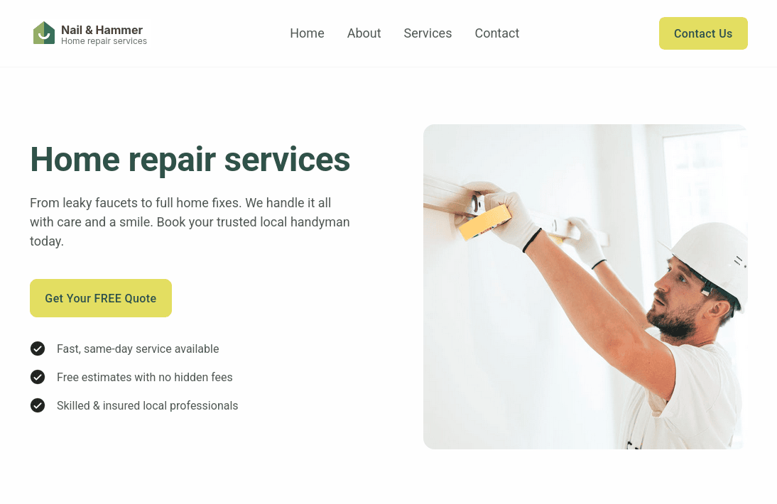
The hero section is the most critical part of your landing page - it's the first thing visitors see and determines whether they stay or bounce within seconds. This section needs to immediately communicate your value proposition, grab attention, and guide visitors toward your call-to-action.
A well-crafted hero section typically includes a compelling headline, supporting subtext that explains your offer, a clear call-to-action button, and a relevant image or visual element. The key is keeping it focused and conversion-oriented - visitors should understand what you're offering and what action to take without scrolling.
We'll build this section using MailerLite's content blocks.
To insert the hero section, click on the "Sections" icon in the left sidebar.
Next, hover over the "Hero" item and select your preferred hero style from the available options.
Drag and drop the hero section into the main landing page building area.

To make any changes to the section, click on the element you want to modify.
For example, you can click on the main title text and write your title. You can also select the text (or part of it) and styling options will pop over the text.

To change the main hero image, simply click on it and click the "Select image" icon.
Follow the same steps we covered for logo uploading. The file manager will open, where you can upload your image from various sources.

You can also duplicate any element by clicking the "Duplicate" icon.
In our example, we can add a new bullet point after the call-to-action button simply by hovering over the list item and clicking the "Duplicate" icon.

We'll configure our call-to-action button after we finish the Contact section, so we can set an anchor link to the contact form.
Here's how our hero section will look:
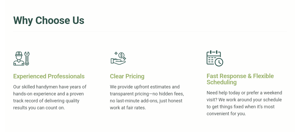
After your hero section captures attention, the benefits section is where you build trust and convince visitors why they should choose you. This section answers the crucial question: "What's in it for me?"
The benefits section should focus on outcomes and results your customers will experience, not just features of your service. Instead of saying "We offer 24/7 support", you'd say "Get answers whenever you need them!". This approach speaks directly to what visitors care about most.
We'll structure this section with clear, scannable benefit points that highlight your unique value proposition.
Click on the "Elements" icon in the left sidebar.
Drag and drop the "Single column" element to the main landing page building area, placing it after the hero section.

Now click on the "Elements" icon again.
Drag and drop the "Heading" element inside the single column you've just added.

Type your text for the subtitle that will describe the benefits section (e.g., "Why Choose Us").
It's recommended to have only one H1 heading element per page for SEO purposes. We're already using one H1 in our hero section.
Every time you add a new heading, it's automatically set to H1. To change this, select the title text, click on the text icon, and select "Heading 2" from the list.

Hover over your element and click on the "Plus" icon, then select the "Three columns" option.

This will add three empty sections where we will add information about the benefits.
Insert three elements into the first container of the section:
-
Image.
-
Heading (change it to H3).
-
Text.
Repeat the same process for the other two containers.
After you fill your blocks with content, you might notice that your columns' vertical alignment is centered.
To make the columns stick to the top and look better, click on the section's gear icon. You'll find it above your title in the top right corner.
Change the alignment by clicking the first icon.

Here's how our benefits section will look:
The services section is where you showcase what you actually offer. While the benefits section focused on outcomes and results, this section gets specific about your solutions. Think of it as your service menu - visitors should clearly understand what they can buy or request from you.
This section works best when you organize your services logically and make each one easy to understand at a glance. Avoid overwhelming visitors with too many options - focus on your core offerings that align with your target audience's needs.
We'll add a prebuilt section from MailerLite's collection.
Click on the "Sections" icon, hover over "Content", then in the new sidebar scroll to the bottom until you see "Listed items on side 3".
Drag and drop this section after your "Benefits" section.
This section has nice "accordion" items.
By default, the title of this section is set to H3. It's recommended to change this to H2 for proper heading hierarchy.
Select your title, click on the "Font size" icon, and change the size to "Heading 2".

To add a new item to the list, hover over a list item and click the "Plus" icon.

You can easily change the order of your items. Simply click on an item and drag and drop it to where you want it positioned.
Here's how our services section will look:

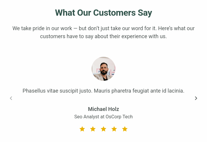
Social proof is one of the most powerful conversion tools on any landing page. The testimonials section builds credibility by showing real feedback from satisfied customers, helping hesitant visitors trust your business enough to take action.
Effective testimonials go beyond generic praise like "Great service!" Instead, they should include specific results, mention particular problems you solved, or highlight unique aspects of your offering. The best testimonials feel authentic and relatable to your target audience.
We’ll use MailerLite’s testimonial section block.
Navigate to the "Sections" tab.
Hover over "Social proof" and choose the section that best fits your design.
Drag and drop it right after the "Services" section.
In this example, we’ll use the "Testimonials 5" section.

This section is quite wide, which might make it harder to read.
Let's adjust the width to make it narrower:
Click the Gear icon in the top-right corner of the section.
Next to the width settings, click "Narrow".

To add more testimonials, click on an existing testimonial.
Then, click the Gear icon above it and select the "Add" button.

Here's how testimonials section will look:
For performance marketers running paid campaigns, the contact form setup directly impacts your ability to track cost per acquisition, optimize bidding strategies, and attribute conversions back to specific ad sets or keywords. The form submission event becomes your conversion trigger - whether you're tracking through Meta, Google Ads, or other platforms.
MailerLite's native forms don't have built-in form submission tracking events. To track form submissions, you have to set things up manually - either by tracking "thank-you" pages or with custom JavaScript or GTM implementations.
This is where dedicated form solutions like Branchside provide advanced tracking capabilities without the technical overhead.
Before we begin, make sure you have created a Branchside form for your site. To learn more about how to create one, check our documentation on creating your first form.
Click on the "Elements" icon and drag the two-column element to the building area.
Add a heading (H2) to the first column.
Click on the "Elements" icon and drag the "Heading" element to the target column.
Change the heading size to H2 and write your text (e.g., "Contact Us").
To embed the Branchside form, we need to add custom HTML to the column after the heading.
From the "Elements", select "Code" and drag and drop it after the heading we created earlier.
Copy and paste the code blocks that will load your form. You can find detailed information in our documentation on how to embed the form on your site.
Your code inside the block should look like:
<div>
  <div class="embedable-form-container" data-formid="<YOUR-FORM-ID>"></div>
  <script defer src="https://static.branchside.com/js/form/0.2/main.min.js"></script>
</div>
It's important to click the "Save" button at the bottom of the code element. Otherwise, your changes will not be saved.

You can add additional text elements to the right column where your company contact details will be listed.
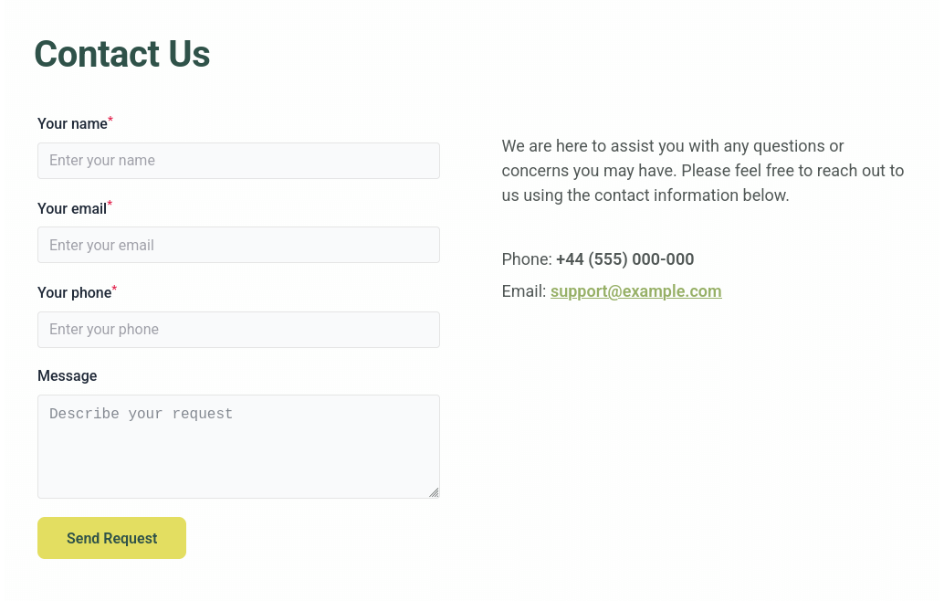
Here's how contact section will look:
Now that your contact section is in place, let's set up the navigation menu. Menu items serve two purposes: they help visitors quickly jump to specific sections of your landing page, and they create a professional, organized appearance that builds trust.
For this landing page, we'll create menu links that correspond to each major section we're building. This gives visitors control over their browsing experience while keeping them on your page.
First, let's name our sections so it will be easier to navigate.
As we are using a landing page, sections don't have actual links (URLs). We'll use anchor links, so visitors will "jump" to the specific page element after they click on the menu item.
At the bottom right of each section you'll see the name and pencil icon next to it. For example, in our "Why Choose Us" section, you'll see the default name "One column".
Click on the pencil icon and rename your section.

We recommend naming your sections clearly:
-
Benefits
-
Services
-
Testimonials
-
Contact
Now let's configure the menu items:
Scroll up and click on the top menu.
Then click on the "Gear" icon.

Click on the pencil icon next to the menu item you want to edit.
Edit the text (e.g., "Why Choose Us").
Select "Anchor block" near the "Redirect to" and choose the section you named above.
Repeat this process for each menu item, linking them to their respective sections.
Now that all our sections are built, it's time to connect the call-to-action (CTA) buttons throughout your landing page. CTAs are critical conversion elements - they guide visitors to take the action you want them to take (in our case it's filling out the contact form).
We have two main CTA buttons to configure:
-
The button in the menu bar
-
The button in the hero section
Both should link to your contact form so visitors can easily reach out from anywhere on the page.
Click on the CTA button in your menu bar.
Click the "Link" icon that appears.
Select "Anchor block" near the "Redirect to" and choose the named section ("#Contact").

Repeat same the Hero Section CTA Button.
You now have a complete, professional landing page built with MailerLite that's optimized for lead capture and conversion tracking. By following this step-by-step process, you've created a page that includes all the essential elements: compelling hero section, clear benefits, detailed services, social proof through testimonials, and a conversion-focused contact section.
The key advantages of using MailerLite for your landing pages are clear: fast setup, no coding required, built-in email automation, and a free plan that lets you ship quickly without upfront costs. For performance marketers who need to test multiple page variations and iterate rapidly, this approach saves valuable time and resources.
For advanced conversion tracking and seamless integration with your marketing stack, consider using Branchside forms instead of MailerLite's native forms. This eliminates the technical overhead of custom tracking implementations while providing the attribution accuracy that performance campaigns require.
Your landing page is now ready to capture leads and drive conversions. Test it thoroughly, connect your campaigns, and start optimizing based on real performance data.
Leave a comment
The email address you provide will not be published. It will be used to notify you of any replies.